Special Topic: Cholera> Time Series Graphs
Published January 2011

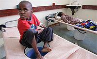
A boy rests on his bed in a
cholera ward of Budiriro
Polyclinic in Harare
December 1, 2008.
REUTERS/Philimon Bulawayo.
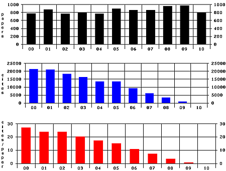
On the one-year time series graph, there are small bumps in papers in various years, such as 2001 and 2005, as well as a high volume of papers in 2008 and 2009. These increases may be accounted for by specific outbreaks of cholera: in 2000, there were outbreaks in Madagascar, Somalia, the Federated States of Micronesia, Afghanistan, and South Africa, which may have led to an increase in paper output the following year. Similar outbreaks might account for the bump in papers in 2005.1 The high volume starting in 2008 might be due to outbreaks in Iraq and Zimbabwe. Citations are higher for older papers, and citations per paper decline in a linear manner, as is generally expected.
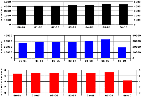
The five-year time series graphs are on a more even keel, but the increase in paper output seen starting in 2008 on the one-year graph is still evident on the five-year paper graph. Cites and cites per paper also show peaks during these periods, indicating that the outbreaks occurring as well as the research done during these times have been garnering citation attention.
References:
1 http://www.who.int/csr/don/archive/disease/cholera/en/index.html
One Year
Five years
General & Additional Information
Currently, we provide graphical representation by papers, cites, and cites/paper in both one- and five-year intervals. The graphs instantly show anomalies and trends: did one year have a higher or lower output than average?
What are Special Topics?
Special Topics, from ScienceWatch.com, is designed to complement Essential Science IndicatorsSM from Clarivate in providing citation analyses and commentary for selected scientific research areas that have experienced notable recent advances or are of special current interest.
Read about the overall methodology for Special Topics in the "What are Special Topics?" page.
Cholera
- Top 20: Authors | Institutions | Journals | Nations
- Papers: 10-Year | 2-Year
- Time Series Graphs
- Field Distribution
- Interviews
SPEICAL TOPICS
- Complete Interview & Topic Menu; a list of all Special Topics with corresponding interviews, essays, or profiles.
- All Topics; listed by date and alphabetically.
- Special Topics Home